
Bing News Vertical Redesign
Bing News is a news aggregator powered by artificial intelligence and a component of Microsoft's Bing search engine.
This design evolution employed a dual-diamond framework: Discover & Define user/competitor insights → Develop & Deliver a restructured product vision.
Role
UX Designer
时间
2018 - 2019
Type

Bing Search
Background
Bing news module serves hundreds of millions of users and millions of daily active users. Even minor changes can lead to significant user dissatisfaction.
Before starting the design, design team conducted comprehensive research and analysis on the product. Based on the insights, we approached product development from three distinct perspectives.
Pain Points
What is the problem that the product needs to solve?
User Needs
What do users want from this product?
Product Trend
What is the trend of news product?
Pain Points
What Do Users Want from This Product?
Information Overloaded
Overwhelming and cluttered
Irrelevant
Random and disorganized, difficult to scan through the news
Disorganized
Distracting, Irrelevant content
Not Personalized
Hard to edit interests and recomend personalized news
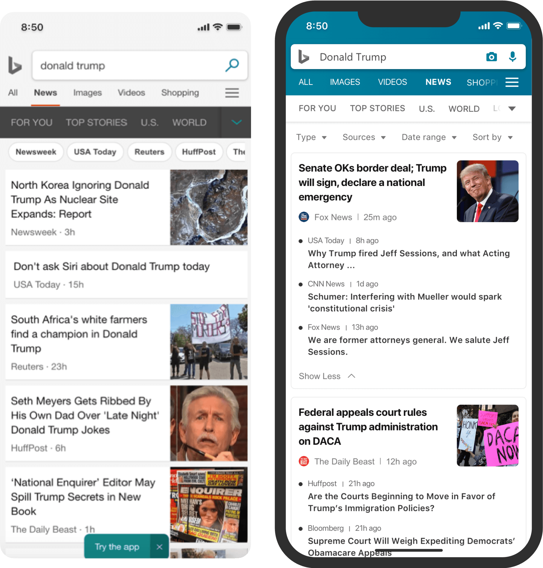
Original Browse
Original Search
User Needs
What do users want from this product?
User Feedback
Visual Effects
Want the original listview; The problem of picture size; The problem of information density and so on.
Control
Want to filter functions; Want to turn off the function of the function module; Want to customize the function and so on.
Interaction
The problem of infinite rolling; Set the position of the button and so on.
User Preference
“ Users like pictures, page layout and filters, but they feel that we lack high-quality search results and content organization.”

Product Trend
What is the trend of news product?
Content-oriented experience
Having a clear order to make content comprehension easier
Removing unnecessary info to focus on product content
Giving content some breathing room
Efficient user experience
Designing with common user navigation patterns in mind
Context-specific features
Simple navigation
Inclusive Design
Content appropriateness/accessibility/ease of use for everyone
Incorporating user study/creating a diverse design team
Google News
Filpboard
Apple News
Clean, minimal, daily briefing, interests, local stories
Design Principle
What kind of product do we want to design?

Design For Trust
Better organization, Cluster, Clear structure
Design For efficient
Better layout, Easy to read, More control
Design For Simplicity
Focused, Modern, Clean and simple
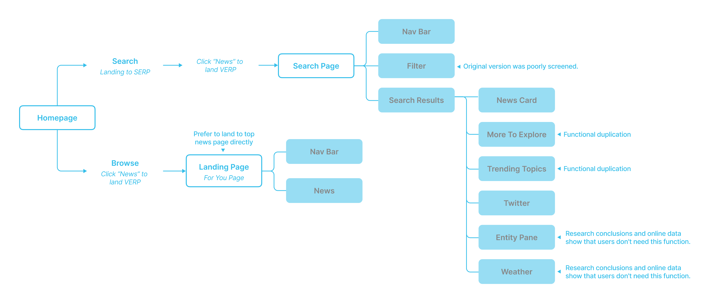
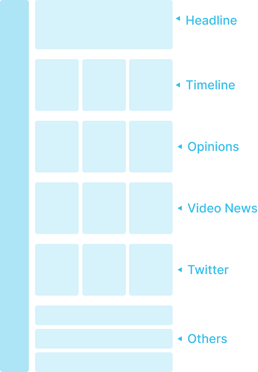
Frame carding
Optimize the process of the whole product.
Original Flow
Redesign Flow
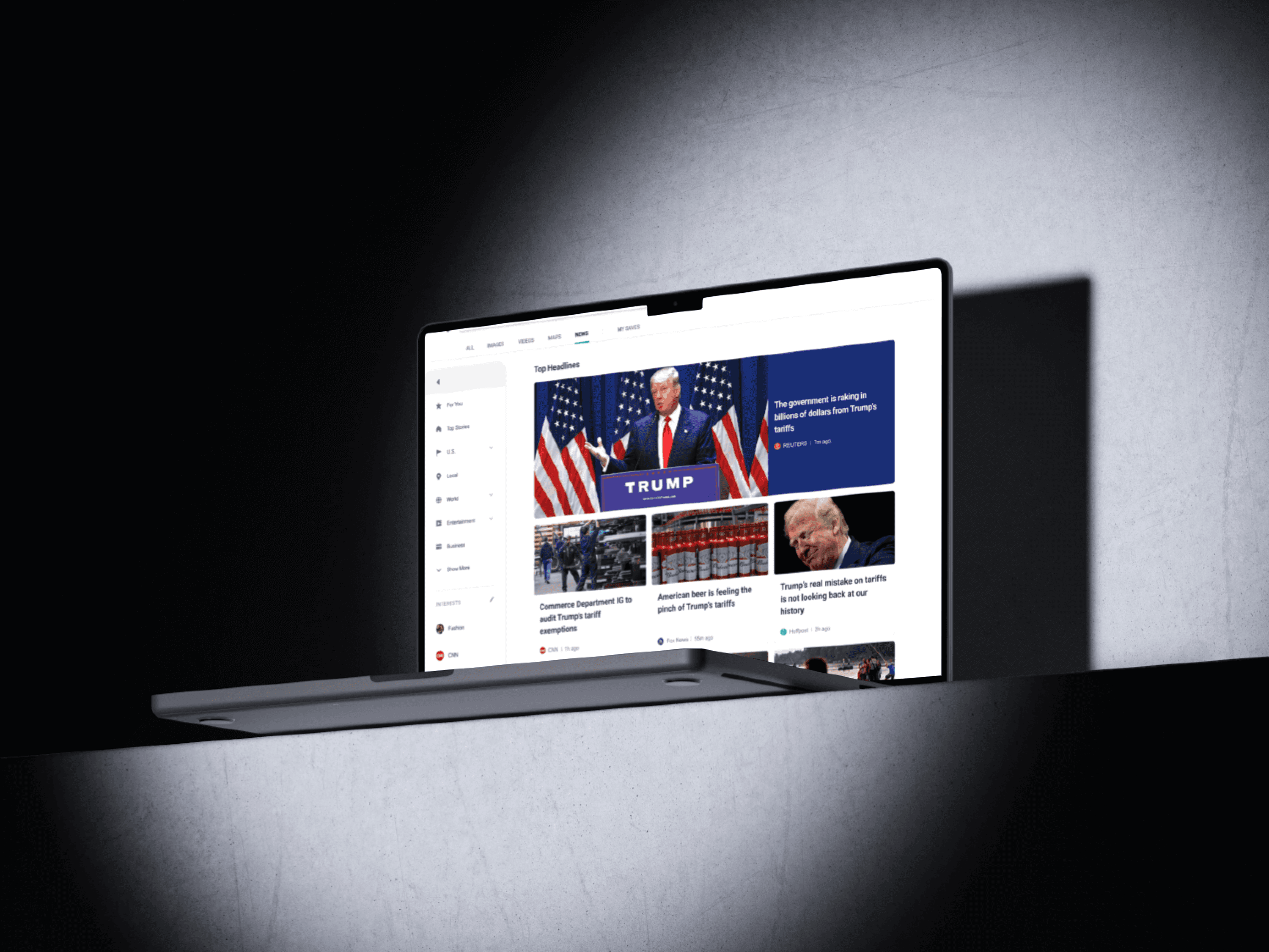
brand New Experience
Move the navigation bar to the left, which follows the user habits.
Larger news title, easy to read and locate.
Leave blank reasonably, so that users can browse more rhythmically and easily.
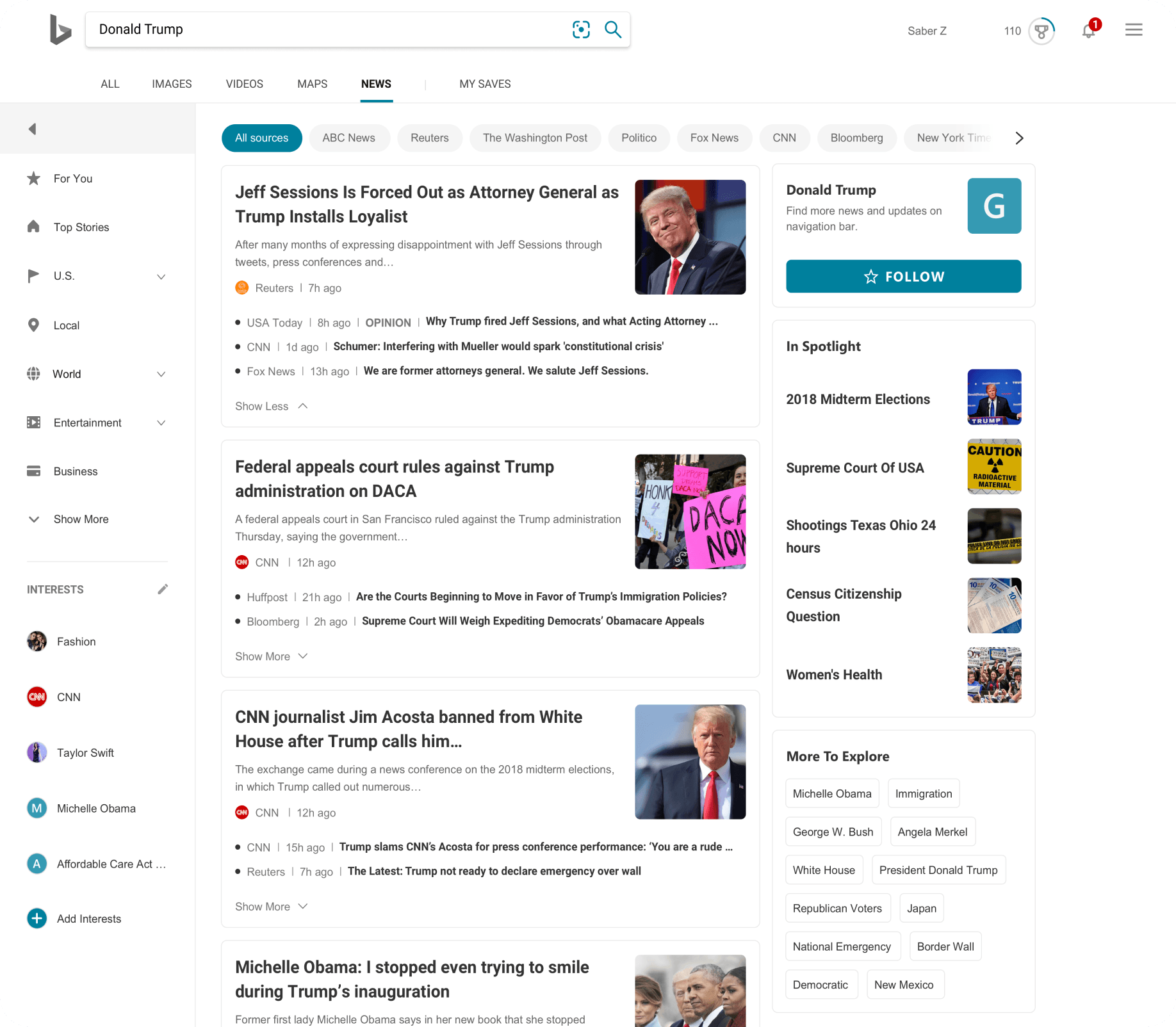
New Search Experience
By adding filtering, users can quickly select what they want to browse.
Organize news with the same content together, reduce duplication, improve users' browsing efficiency.
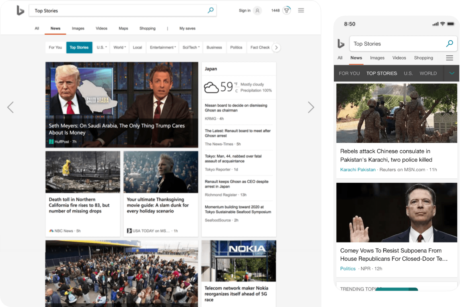
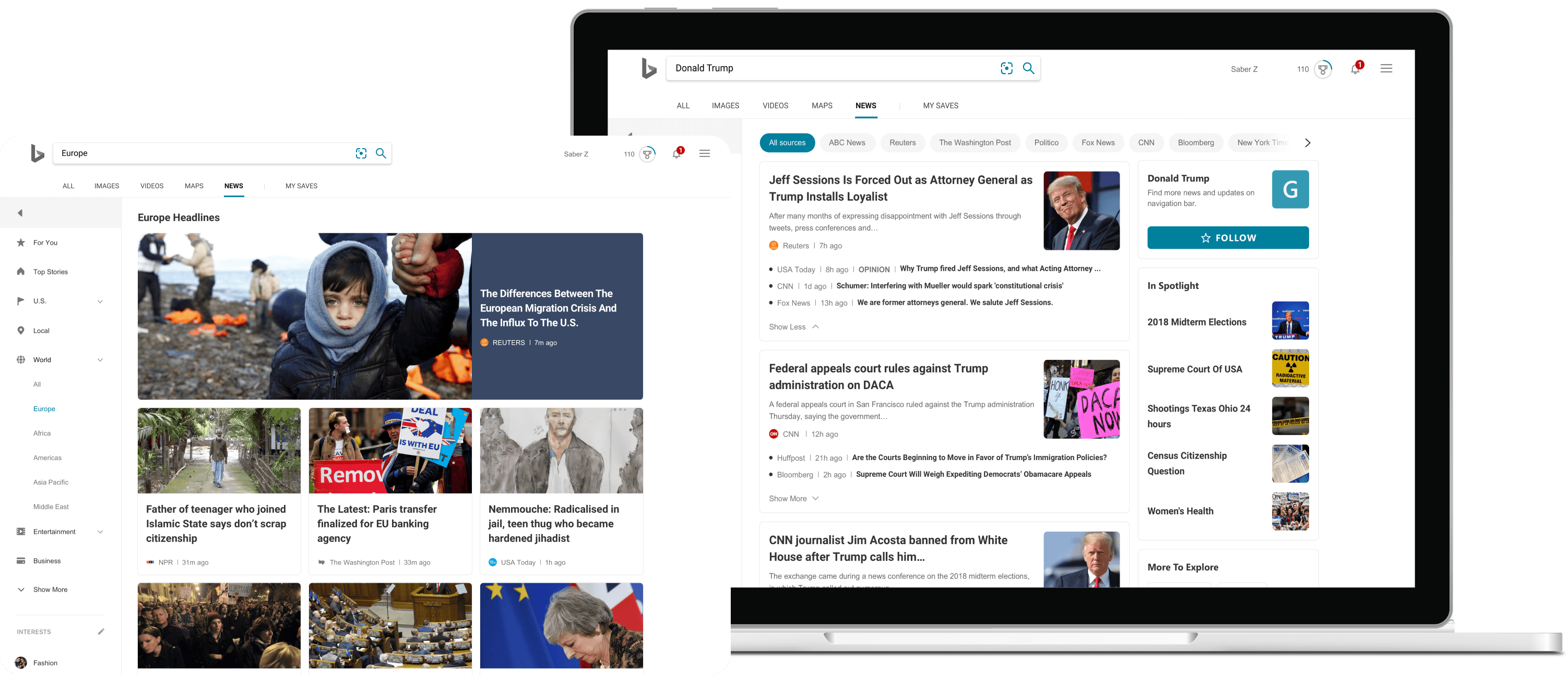
Original Search
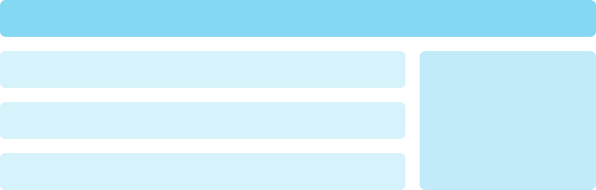
Redesigned Search

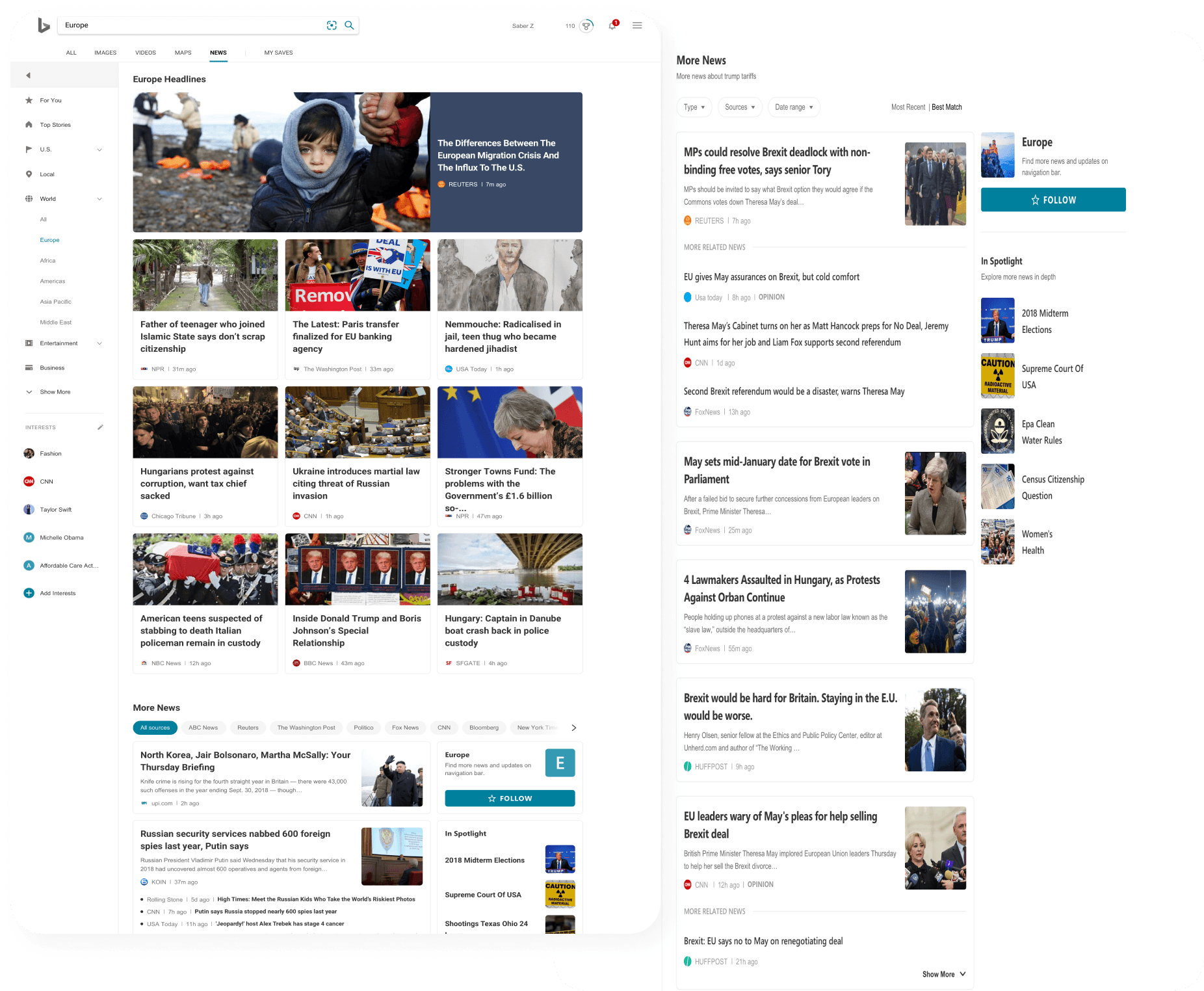
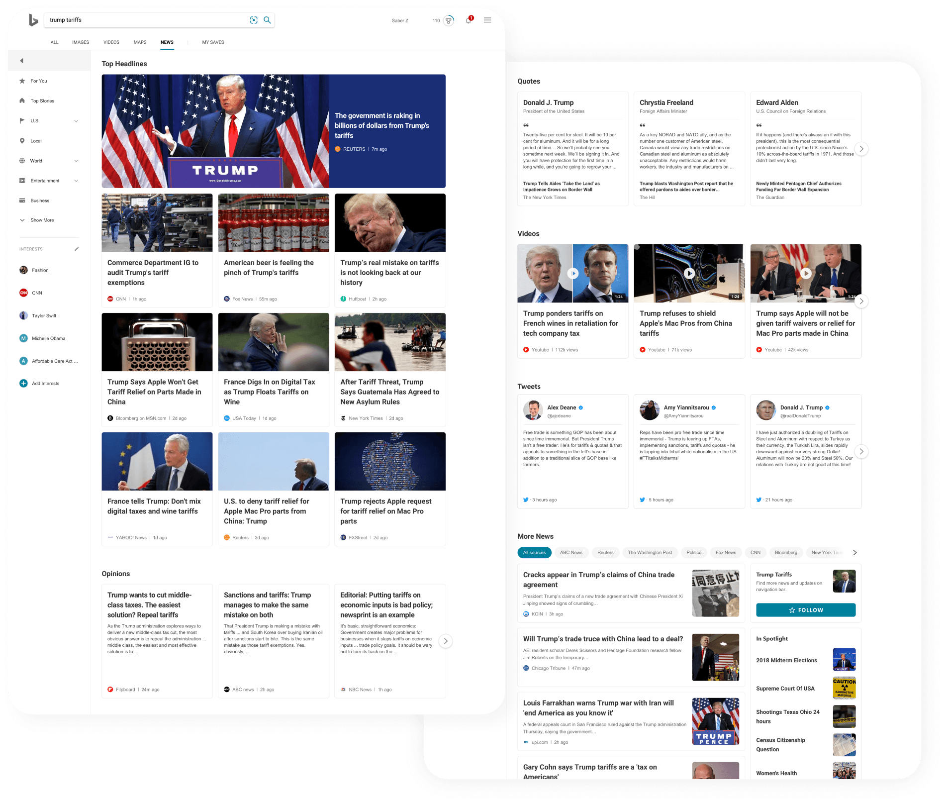
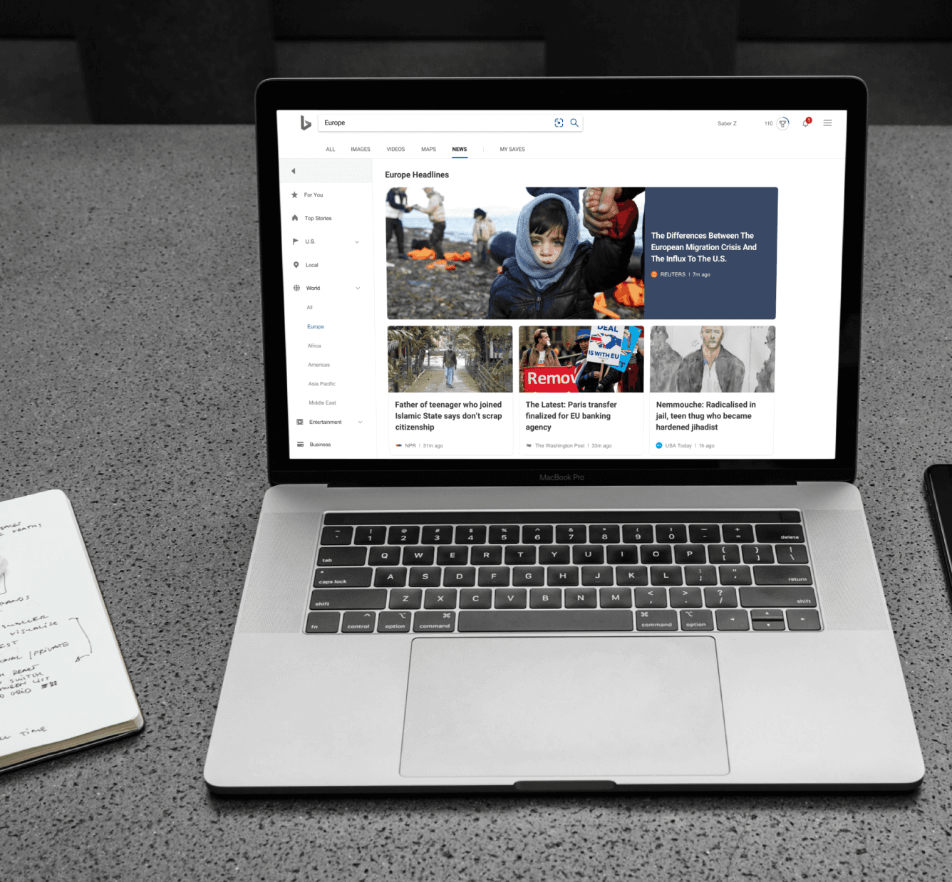
New Browse Experience
Combined with the list layout, change the design that the whole page is cards.
Highlighting headlines allows users to get the most content in the shortest time.
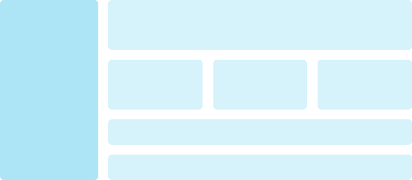
Original Browse

Redesigned Browse
Perspective New Consumption Experience
Combine various news contents, supplying a better convenient browse experience.
Diversified news sources give users a more authoritative feeling.
Looking at the whole incident from multiple angles, we can understand it more comprehensively.
Usability test
After the new design, we recruited 20 native users to test usability on the new and original versions.
1/2 participants are Bing users and 1/2 participants are Google users.
Positive Feedback
Most subjects prefer the new design, thinking it is more organized and visually attractive.
Subjects especially like to move navigation to the left of the page, which can better distinguish it from filter bar and make them easier to use.
The subjects also felt that they noticed more features on the right side of the page (which many users ignored in the current design).
Suggestions
When asked about ways to improve the new design, 55% of the participants couldn't figure out what they would change.
Other subjects thought that the three-column page layout was a bit messy, and suggested removing the right sidebar completely.
They also reiterated the suggestion that search results pages should be automatically sorted according to recent results.
Some people find inconsistencies in design, such as font differences and colors, a bit distracting.
Mobile Design
Mobile has a small screen and can carry less content, so we do subtraction as much as possible when designing the mobile terminal to keep the design simple and clear-cut.
Browse
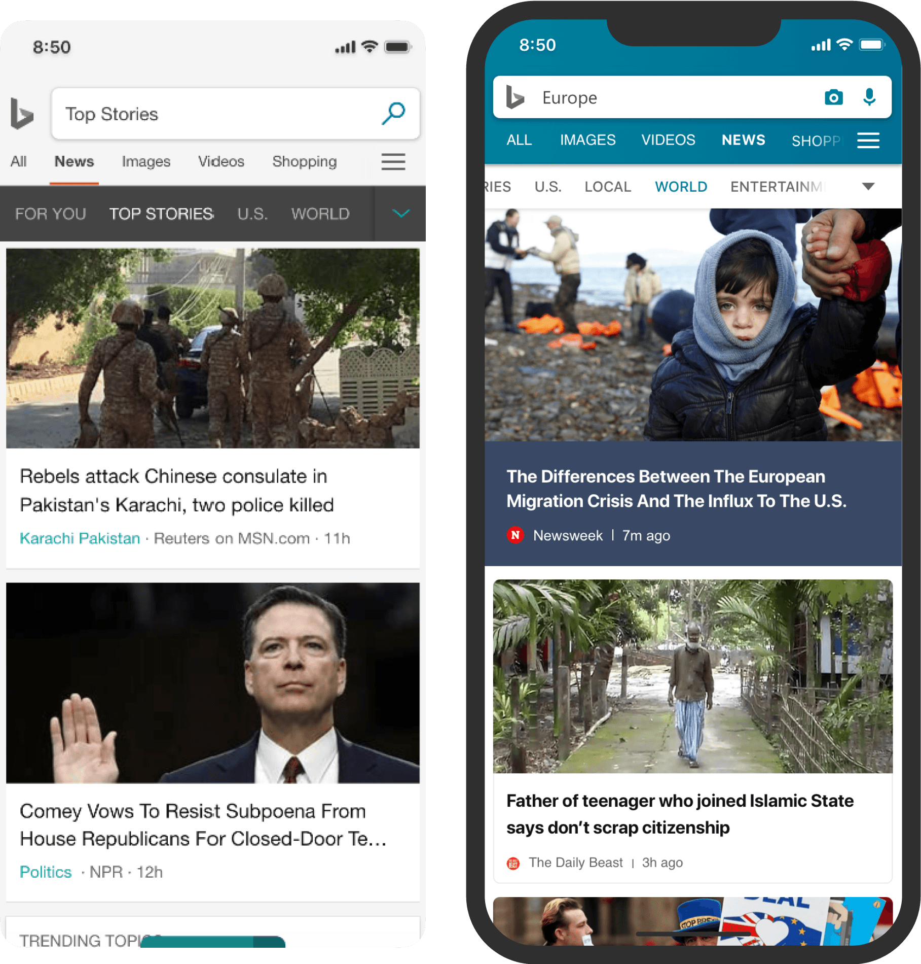
Search
Design Exercise
We make paper models of each module for users to design pages freely, and we will observe and ask if we know the functional attributes of each module during the user's design process.

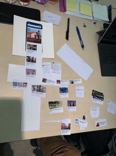

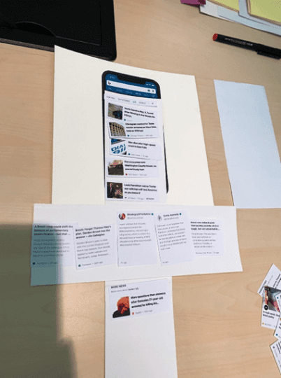
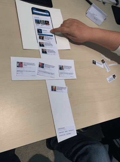
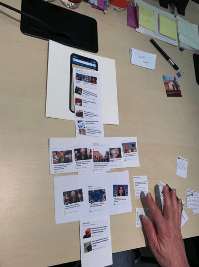

Through tests and interviews, we want to know:
Understand how users view the latest news vertical design on mobile platforms.
Understand the behavior patterns of users in news browsing and search.
Do users need and understand our newly added functions on the mobile terminal?
How users use filters on the mobile side?
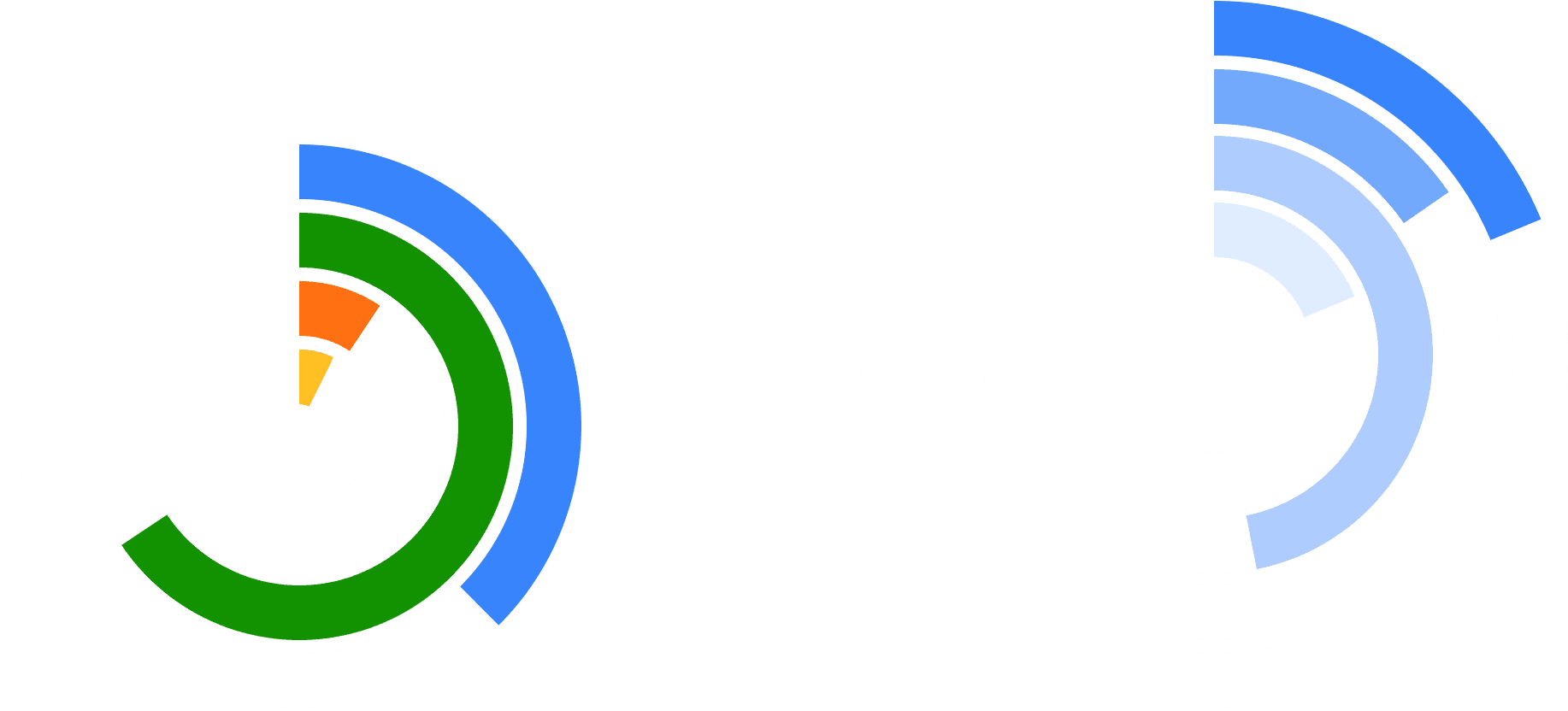
User satisfaction score
1 = Very dissatisfied, 5 = Very satisfied

Key Achivements
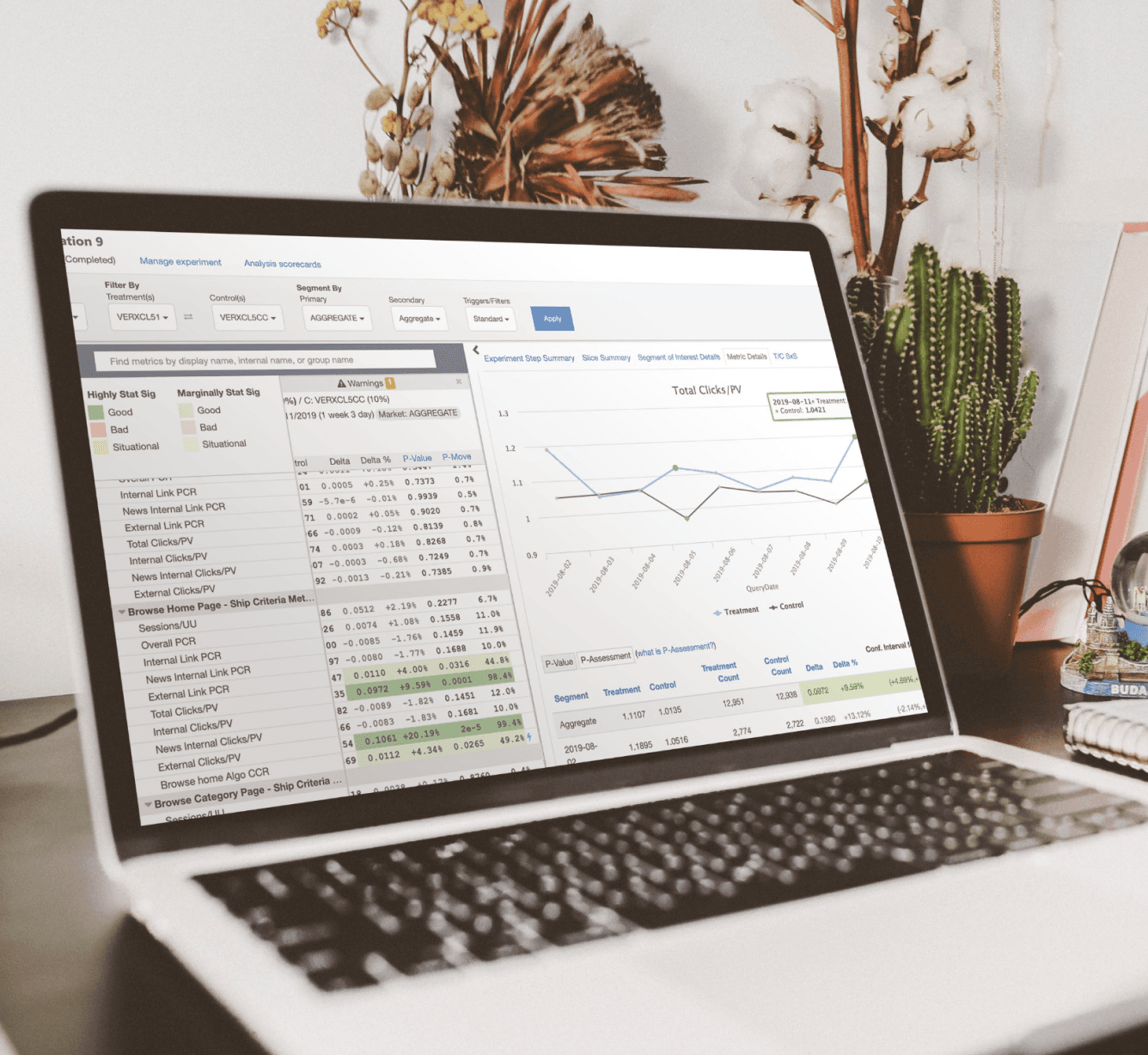
Data Feedback
Total page click-through rate
9.59%
Takeaways
The importance of user research to design is self-evident, especially when designing for unfamiliar groups with different cognition and habits across regions and cultures.
Don't design for the ideal scene. For products driven by artificial intelligence, the quality of content will not be selected by editors, and they are uncontrollable.
More…


